Task 1 - Exploration
.jpg)
TANG LILIN (0376668)
Visual Analysis
Phrase 1 : Observation

The Reason Why I Selected this Design Work?
When I first saw this work, I was captivated by Antoine Doré's use of color and the atmosphere of harmony between human and nature in the image.
What attracted me the most was the bold contrast of colors in the work, which is a signature feature of Doré's work. The contrast between the warm orange cityscape and the cool purple and blue-green plants creates a surreal atmosphere. The use of color to distinguish the foreground, midground and background enhances the layering and three-dimensionality of the image. This design puts me in the scene, as if I can feel the breeze rustling through the leaves and see the plants growing uncontrollably. The black cat in the center of the picture seems to be enjoying the cityscape in front of me, showing the harmonious relationship between human and nature.
Overall, this work brings me a very strong visual impact. Its colors, composition and narrative fit perfectly with the theme of “Urban Nature”. It resonates strongly with me and makes me appreciate nature more and realize the importance of protecting the environment. I hope that in our daily life, society can establish a more harmonious relationship with nature. ( 195 words )
My Observations:
Color Palette: The warm orange cityscape, along with the purple and cyan-green plants, adds a dreamy and slightly surreal atmosphere to the artwork. The strong contrast between purple and cyan-green creates vibrancy while maintaining balance. The use of neon tones further enhances the sense of mystery, blending naturally with the black cat at the center of the composition. The cyan-green plants in the midground bring vitality to the scene.
Composition: The artist skillfully uses color to clearly distinguish the foreground plants, midground plants, and the distant cityscape. This clever layering enhances the readability of the artwork.
Perspective: The foreground plants appear larger, while the distant cityscape appears smaller. Additionally, the chosen viewpoint aligns closely with the height of the cat, creating an immersive perspective. This perspective technique strengthens the storytelling aspect of the artwork.
 |
| fig 1.1 Analysis by Rule of Thirds |
Phrase 2 : Analysis
1.Gestalt Theory
- Closure: the plant in the foreground partially obscures part of the window outline, but when we browse the painting we can still naturally visualize the information in our minds, which enhances the immersion of the reader when enjoying the painting.
- Continuation: The plant forms and the lines of the window frames guide the viewer’s eye from the foreground to the background, creating a sense of space. The plant forms in both the foreground and mid-ground lead the reader's eye to the cityscape in the background.
2.Contrast
- Color Contrast: cool purple and lime green are used in the plants in the foreground, and warm orange and yellow are used in the city in the background, which form a strong contrast and make the picture very attractive.
- Texture Contrast: The detailed texture of the plants in the front contrasts with the rough texture of the plants in the center, adding visual interest.
- Color Emphasis: The yellow oranges in the background reinforce the contrast of the black cat from the warmer city, thus providing a focal point for the painting and lighting the way for the attention of the viewers that often subconsciously rest on the cat.
- Contrast Emphasis: Two light/dark pairs of opposing contrasts:
- The surroundings consist of a dark, the city, and light plants which demarcate the center and foreground as being light, as well as the city and building background, defining regions of interest that work in conjunction with the light dark blending differences. These provide emphasis to the focal black cat.
- There are dark plants in the foreground and mostly light center plants. This combination will provide emphasis to the center and background parts of the composition.
4.Balance
- Visual Balance: The plants on the left and right sides of the composition have similar shapes and sizes, creating a sense of dynamic balance. The black cat, positioned along the rule of thirds, serves as a stable visual anchor.
- Color Balance: Cool-toned plants frame the outer edges of the composition, while the warm-toned cityscape is concentrated in the center. This strategic use of color naturally draws the viewer’s gaze toward the middle, emphasizing both the city and the black cat as focal points.
- Line Direction: The curving shapes of the foreground plants and the hanging vines create dynamic, flowing lines that add a sense of movement to the composition.
- Gradual Scale Change: The foreground plants appear larger, while the background cityscape appears smaller. This gradual transition in scale from foreground to background mimics depth perception, guiding the viewer’s eye smoothly through the scene.
6.Harmony & Unity
- Color Harmony & Unity: The composition maintains consistency by using a limited color palette of cool tones (purple, teal) and warm tones (orange, yellow). The sky in the background cityscape transitions from light red to soft orange to yellow, creating a natural and harmonious gradient.
- Thematic Unity: The black cat serves as the focal point, bridging the natural world in the foreground with the urban environment in the background. Its presence unifies the two contrasting elements, preventing visual disconnection. Meanwhile, the window acts as a dividing line between nature and the city.
6.Symbol
- The focal point of the image, the black cat, has a symbolic meaning. Ancient Egyptians worshipped black cats because of their association with the cat goddess Bastet, symbolizing protection, prosperity and divine power. In relation to the theme of this piece, “Urban Nature”, the black cat is like the guardian of Mori. The black cat sits quietly in front of the window, like a forest guardian. This suggests that the natural environment in the city is disappearing, and the black cat as a guardian is like a reminder to people to pay attention to the relationship between human and nature.
- In modern culture, black cats are often associated with independence, self-confidence, and mysterious temperament, for example, in pop culture, black cat characters are usually smart, witty, and uninhibited images. It sits quietly in its chair, enjoying its own world. This may represent the pursuit of freedom in the city, or the desire to be alone in nature to relax and seek balance, as well as the process of pursuing oneself due to the stress of daily work.
Phrase 3 : Interpretation
About the Author:
Antoine Doré is a French illustrator and artist whose work is influenced by the science fiction aesthetic of the 1950s and 1970s, often with a retro sci-fi feel and a blend of punk and futuristic elements, while using a strong narrative and visual impact with a tense use of color. His work is often laid out using a grid system. His work is characterized by clear outlines, subtle lines, and distinct color blocks. His work often contains a sense of storytelling, bringing not only visual impact, but also provoking the viewer to think.
The theme of this work is Urban Nature, which explores the relationship and balance between the city and nature. The plants inside the window represent nature, the cityscape outside represents the city, and the black cat in the center of the picture symbolizes the link between the two, as well as the guardians of the forest or the humans in the city.
The work may be a metaphor for the impact of urbanization on the natural environment. With the advancement of human civilization and industrial civilization, there are more and more skyscrapers in the city, and the economy of modern society is becoming more and more prosperous, which also brings many natural environmental problems such as global warming, and everyone is calling for the reduction of carbon emission. In this work, I also see that the author is calling for sustainable development.
The presence of the black cat is like an observer, sitting quietly by the window and looking at the city in the distance. It is like people in real life who are pondering whether to continue to lose themselves in their laborious work or to find a more balanced and natural life. It is a reflection on inner belonging.The contrasting colors bring curiosity to the viewer to take a closer look at the piece. The gradation of colors (orange, pink and yellow) used in the sky outside the window gives a peaceful, warm twilight color, which creates a feeling of rest and contemplation in the viewer, and brings the viewer a calm feel. The green plants in the foreground are full of vitality, giving people a relaxing and healing psychological feeling.
1. Gestalt Theory
Principle of Similarity
When we see elements that are similar, the brain automatically groups them together and assumes that they are somehow connected, even if they don't actually lean together.
 |
| fig 1.2 Principle of Similarity source:BannersnackBlog |
Example:
The image features multiple Coca-Cola bottles arranged in a sequence from small to large and back to small, resembling a smiling mouth. Tiny Coca-Cola bottles are placed at both ends to form the corners of the smile.
How to Reflect the Principle of Similarity:
The repeated use of similar Coca-Cola bottles allows the brain to perceive them as a unified whole, forming a smile that connects with the text "happiest" below.
Principle of Continuation
In a design, the eye naturally follows the direction of lines, curves, and paths, preferring continuous flow over isolated elements.
 |
| fig 1.3 Emphasis source: images-na.ssl-images-amazon.com |
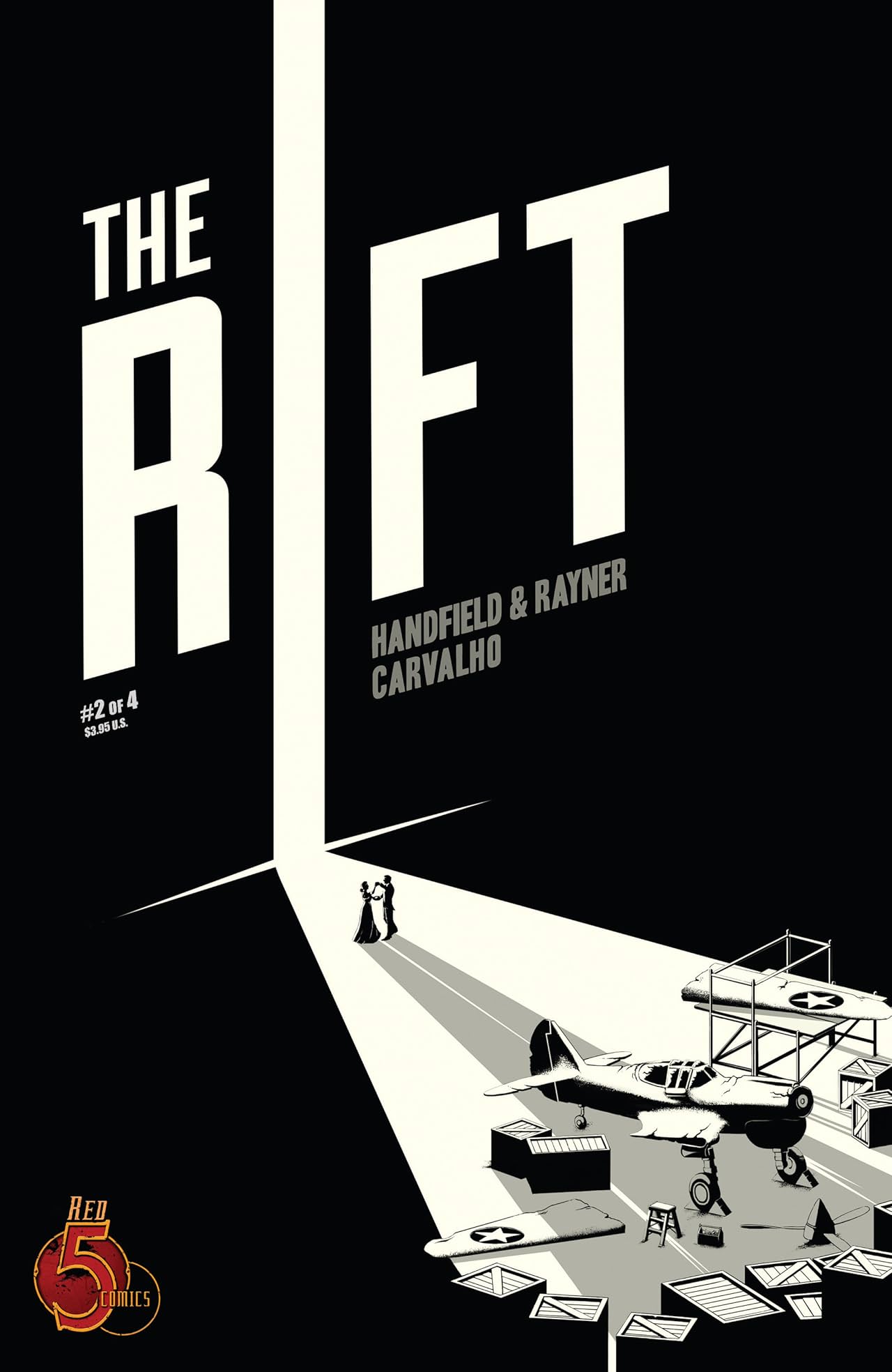
How to Reflect the Principle of Continuation:
When I first look at this work, I first see the word “rift”, and then I follow the letter “I” all the way down to the bottom right of the image. This is because in the image, the letter “I” in “RIFT” is converted into a strong beam of light, creating a clear guiding path from the top to the ground. This guides the viewer's eye fluidly through the entire composition.
Principle of Closure
When we see an incomplete figure or image, our brains automatically brainstorm the missing parts to help us put together the complete image or shape.
 |
| fig 1.4 Principle of Closure source:https://vinti7.com/36-disenos-en-espacio-negativo/ |
How to Reflect the Principle of Closure:
When I first saw this artwork, I noticed the gentleman made up of the outlines of the incomplete violin images above the left and right and the lines around the edges of the image, and the black bow in the center of the image. Even though we don't see the complete image, our brains have helped us piece together the image that is the missing part, so we are able to get the full picture.
Principle of Proximity
Elements that are placed close together are perceived as related, helping to organize information and improve readability.
 |
| fig 1.5 Principle of Proximity source:https://www.pinterest.com/pin/21110691981490751/ |
How to Reflect the Principle of Proximity:
In National Geographic magazine layouts, titles are positioned near related images, enhancing readability while helping designers structure other elements systematically.
Principle of Figure/Ground
This principle describes the relationship between foreground (subject) and background, where the foreground is emphasized while the background is perceived as secondary.
Three Types of Figure/Ground Relationships:
- Stable: Clear distinction between figure and background.
- Reversible: The figure and background can switch roles.
- Dual Meaning: The image can be interpreted in multiple ways.
 |
| fig 1.6 Principle of Figure and Ground source:https://www.pinterest.com/pin/1116189088900650663/ |
How to Reflect the Principle of Figure/Ground:
- The upper part of the image depicts black birds against a white background.
- The lower part features white raindrops against a black background.
- These elements can visually switch roles, making the figure and ground interchangeable.
Law of Symmetry & Order
The human eye prefers symmetrical shapes, as they are easier to categorize as a whole, enhancing stability and recognition in design.
 |
| fig 1.7 Law of Symmetry & Order source:https://www.pinterest.com/pin/68046644364857870/ |
How to Reflect the Law of Symmetry & Order:
The image of a parrot is symmetrically aligned along a central axis. Additionally, the parrot is composed of color-blocked elements, further reinforcing balance and stability in the composition.
2. Contrast
Contrast can make a design look more layered and make content easier to read. By adjusting the color, size, shape, orientation, or spatial differences, you can make important elements stand out more and draw attention to them.
Types of Contrast:
- Color Contrast: Using warm (yellow) and cool (blue) colors for distinction.
- Size Contrast: Differentiating elements through scale, focus viewer's eyes on the more important element.
- Shape Contrast: Using varied forms to create emphasis.
- Direction Contrast: Positioning elements in opposing orientations.
- Negative Space Contrast: Using empty space to highlight subjects.
 |
| fig 1.8 Contrast source:https://www.pinterest.com/pin/1116189088900308381/ |
How to Reflect Contrast:
- Color Contrast: In the image, yellow and blue are used, a set of contrasting colors
- Tone Contrast:Low saturation blue and warm yellow-orange, through the contrast of warm and cold tones, can bring viewer a strong sense of emotional impact. Emotional downturn in the blue populace, suddenly in the crowd, there is a bright woman standing in the center of the picture
- Direction Contrast: A crowd of blue figures is facing away, while a single yellow figure faces forward.
- Negative Space Contrast: The blue crowd serves as negative space, making the yellow figure the focal point.
These contrasts clarify the visual hierarchy, making the design more readable and impactful.
3. Balance
Balance requires us to make sure and weigh the elements in the design harmoniously arranged to achieve visual balance, if we want to achieve balance, then we must balance all the objects in the picture, colors, textures, and the elements between the elements of the static and movement.
Types of Balance:
- Symmetrical Balance: Mirror-like reflection along an axis.
- Asymmetrical Balance: Unequal distribution of visual weight using size, shape, or color contrast.
- Radial Balance: Elements arranged around a central point.
- Grid Balance: Using a grid system for structured layouts.
 |
| fig 1.9 Balance source:https://www.behance.net/gallery/82538423/Balance?tracking_source=search_projects_recommended%7Cbalance |
How to Reflect Balance:
- Asymmetrical Balance: Asymmetrical balance is used in the image, utilizing two large semicircles, and one small circle in the composition. The bottom blue semi-circle serves as the main color support, while the top yellow semi-circle and purple circle are placed above the blue semi-circle in varying degrees of inclination to achieve visual balance.
- Color Balance: Dark blue, yellow and purple are used in the image, with strong contrasts between the three colors. The background, on the other hand, utilizes a light pink color. The dark blue shape is large, while the yellow semi-circle and purple circle above it are small and lightweight. This arrangement of color distribution also achieves visual balance while such a contrast of warm and cool colors maintains the overall color harmony.
- In addition, the text Balance at the bottom left of the image is underlined. Together with the tilt of the three geometric shapes, I think the visual balance is also achieved.
4. Emphasis
Emphasis draws attention to a specific element by making it more visually prominent.This allows the viewer to quickly perceive the focus point in the frame.
Types of Emphasis:
- Color Emphasis: Using bright or contrasting colors. Contrasting two colors that are far apart on the color wheel, such as contrasting and contrasting colors, to make elements more visually appealing.
- Size Emphasis: Enlarging important elements.By increasing the size of certain important elements, make them visually appealing.
- Shape Emphasis:Utilizing different shapes or forms to create visual interest. For example, in a piece of artwork, the left and right elements are triangles, while the emphasized subject is a circle.
- Direction Emphasis:Change the direction of the emphasized subject to create contrast in the image. For example, in a work where all the elements are arranged horizontally and the emphasized subject is arranged vertically.
 |
| fig 1.10 Emphasis source: trufcreative.com |
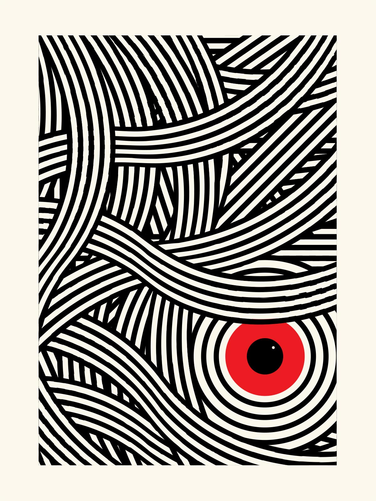
How to Reflect Emphasis:
- The red and black circular elements in the lower right corner create a focal point.
- Color Emphasis: The background is off-white, while red and black elements create high contrast.
- Contrast Emphasis: The design uses strong linework and filled circles to enhance the focal point.
These techniques highlight the eye-like shape, ensuring it captures the viewer's attention.
5. Repetition
Repetition is actually the repeated use of elements like color, shape, size or texture in a design, which creates a sense of rhythm or regularity. This has the advantage of making the important things stand out more, as well as making the whole design look clearer and easier to understand.
Repetition can be categorized into:
- Color Repetition
- Shape & Pattern Repetition
- Typography Repetition
- Imagery & Icon Repetition
- Layout Repetition
 |
| fig 1.11 Repetition source:https://www.francesmotta.com/tedxyyc-2018/ |
How to Reflect Repetition :
- Color Repetition: The design uses a black background with repeated red elements.
- Shape Repetition: The red "X" elements in the center are arranged in perspective, creating a strong visual rhythm.
- Variety: Although the red "X" elements are repeated, perspective is used to alter their size, adding depth and making the composition more dynamic.
- This repetition enhances the visual unity and allows the reader to recognize the key information in the image at a glance. However, the change in the form and angle of the X adds to the rhythm of the image.
6. Movement
movement refers to the designer's pre-determined flow path through the piece so that the viewer navigates the entire piece in a planned route when seeing this piece. This allows the designer to convey a more layered and logical message. movement gives the picture a sense of flow and enhances the rhythm of the work. It makes the design more alive and vibrant and communicates better with the viewer.
 |
| fig 1.12 Movement source:https://en.wikipedia.org/wiki/The_Great_Wave_off_Kanagawa |
How to Reflect Movement :
- Leading Lines: The foreground wave lines direct the eye toward the waves in the upper left corner. Wave lines in the upper left corner direct the eye toward the lower right corner of the frame
- Gradual Scale Change: The foreground features large waves, while Mount Fuji in the background appears smaller, simulating depth and distance. This visual transition enhances the sense of movement in the composition.
- Rhythm: The fishing boats in the waves are tilted at different angles due to the different heights of the waves, creating a sense of rhythm. The waves rise and fall in the picture. The waves in the foreground echo the waves in the center, creating a sense of movement in the composition.
7. Harmony & Unity
- Color Harmony: We can achieve color harmony by using like colors, similar colors, or monochromatic colors.
- Shape Harmony: We need to make sure that the geometric or abstract shapes in the image all present the same visual impression to achieve shape harmony.
- Harmony of texture: We can use some texture to enhance the harmony in the picture, but we need to make sure that it will not make the picture divided.
- Harmony of subject and style: We need to make sure that the elements in the image use the same visual language to achieve harmony of subject.
 |
| fig 1.13 Harmony & Unity source:https://www.pinterest.com/pin/1116189088900616734/ |
How to Reflect the Harmony & Unity:
- Color Harmony: The picture uses mainly warm orange tones. Orange, brown, bright orange, and pink are a series of neighboring and similar colors that form a harmony of colors. The warm colors contrast strongly with the black color of the hair, creating a dreamy atmosphere.
- Shape Harmony: The hair is mostly made up of different shapes of leaves, although the shapes and sizes and colors are not the same, they bring a very harmonious and unified visual impression.
8. Symbol
 |
| fig 1.14 Symbol source: m.youtube.com |
How to Reflect the Symbol:
- Apple: In the Bible - Genesis, the apple symbolizes the forbidden fruit in the Garden of Eden, representing knowledge and wisdom. Meanwhile, in western culture, Newton discovered gravity by dropping an apple, so the apple is often used to symbolize the pursuit of knowledge and enlightenment. Therefore, the Apple logo symbolizes creativity and modern technology.
- Bite: The apple in the logo has been bitten. The words “bite” and “byte” have the same pronunciation, which is a double meaning. Symbolizing the connection between technology and the computer industry.
9. Word & Image
 |
| fig 1.15 Word & Image source:Instagram |
How to Reflect the Word & Image
When you first look at the poster, the first thing you see is the cat's wide-open mouth, then you see the text WEOW next to it, and then you notice the text box “cat” in the upper right corner, and the description of the cat in the lower right corner.
The whole picture is printed in a retro dot-matrix style. Simple and practical orange, beige and white, gray and black colors. It is visually more unified.
The cat's big open mouth in the picture and the text MEOW next to it, as if the cat is letting out a loud cat call, the text and the picture have a close connection. It enhances the sound and dynamics of the picture. In addition, the whiskers of the cat seem to be a guide line, which visually and naturally guides the viewer's line of sight from the cat's mouth to the text MEOW. the text in the lower right corner describes the characteristics of the cat, and the same color as the MEOW font, which visually assists the expression of the WEOW text and enhances the effect of visual communication.
Exploration
Two questions arose for me during the course of my study:
1.What is the difference between contrast and emphasis?
2.In design principles, some principles are used to guide the viewer's eye along a path, line, or direction designed by the creator to navigate the composition. For example, the Principle of Continuation and Movement in Gestalt Theory both serve this purpose. What is the difference between these two principles?
Principle | Core Differences | Visual Characteristics |
Contrast | Contrast between two or more elements | Strong color/shape/size variations |
Emphasis | Draws attention to a specific focal point | Highlighting a point through color, white space, or size |
Continuation | Visual guidance for smooth reading | Lines, curves, perspective |
Movement | Make static images look dynamic | Kinetic blur, repetitive shapes, streamlined design |
-
It is the most basic unit of measurement in any design.
- A series of connected and successive points can create lines.
-
A point that moves in space can create shapes in 2D or 3D.
-
Lines may be dynamic or static, conveying a different emotion.
-
Lines can point descriptions of things and places, hint masses, and express feeling and action.
-
Lines may be combined to portray a grouping of light and darkness, or patterns and textures.
-
Shapes are the boundaries of an area that is two-dimensional or the outline of an object that is three-dimensional.
-
Shapes are created by bounded lines or color and texture changes.
-
Shapes can be classified into:
- Geometric shapes : They are precise and regular.
- Organic shapes : They are natural and hard to define.
- A shape exists in two-dimensional space while a form exists in three-dimensional space.
- The space enclosed by a form is called volume.
- In two-dimensional media like paintings and illustrations, form is suggested through light, shadow, and perspective.
-
Texture indicates the quality of the surface of the object and its representation.
-
It can be classified into:
- Actual texture: which is touchable and physically exist.
- Implied texture: which imitates an actual texture
-
Space is a term used to denote the region in which every item is located, which may appear to be void or occupied.
-
In graphic designs, space can be divided into:
- Positive space (filled areas).
- Negative space (empty areas).
-
Adding dimension through overlapping, alteration of size, and perspective gives the impression of having three-dimension space.
-
Color is defined as the may of visual perception based on the light and its waves color as being reflected and absorbed.
-
Three fundamental properties of colour:
- Hue: It signifies the color (e.g., red, yellow, blue).
- Value: It indicates the color brightness as a result of increasing and decreasing brightness.
- Intensity: It defines the purity of a color reduced by adding black, white, or gray.
- Common colour schemes:
- Monochromatic: distinctive changes in the brightness of a single hue.
- Analogous: colors that are next to each other on the color wheel.
- Complementary: colors that are next to each other, which creates the most extreme differences.

- Contrast is the juxtaposition of strongly different elements.
- Contrast enhances visual interest, emphasizes key elements, and conveys meaning.

-
'Gestalt’ is a German word for shape or form. The gestalt principles outline how the human eye structure into a whole elements that are separately visualized.
-
This set of rules shows how we break down complex visuals into simpler basic geometric shapes as well as how we resolve and integrate different parts into one coherent whole design.
- Principle of Similarity – The eye tends to group similar elements together as a whole, even if they are apart. The brain makes use of the existing structure to make associations between similar things.
- Principle of Continuation – A viewer will track paths, lines, and curves in any given design. Disconnected elements are less favored than a continuous flow of parts.
- Principle of Closure – People tend to prefer when something is whole rather than in parts. Even if an image is incomplete, the missing components will be filled in by the mind.
- Principle of Proximity – Related design elements should be placed together while unrelated ones should be distanced. Close proximity facilitates the creation of organized layouts and structures.
- Principle of Figure/Ground – The mind differentiates the foreground (figure) and the background automatically. Usually, the figure is more prominent than the ground which fades away.
- Law of Symmetry & Order – Elements that are symmetrical are more easily perceived to form a whole. Just like the principle of similarity, symmetrical forms are more frequently perceived as being grouped together.

Lecture 2 - Balance & Emphasis
Balance
Balance denotes how the elements of a work are visualized, which is classified into two types of balance: symmetrical balance and asymmetrical balance.
- Symmetrical Balance: This is when the two sides of the work are visually equal.
- Bilateral Balance:While bilateral balance is created in the design when elements are balanced on either side of a vertical or horizontal axis evenly, these elements will seem like they have some kind of relation between them.
- Radial Balance: Radial balance is achieved when an item is designed with elements around a centered point in which the elements around are evenly spread.
- Approximate Balance: Approximate balance is when design elements that look alike but not quite are arranged around the center symmetry line.
- Asymmetrical Balance: This happens when one side of the visual unit contains a heavy, important detail while the other side has several smaller details to balance it out. There is no symmetry in the balance; that is why the rational parallels between the units diverge. Asymmetrically balanced designs are deemed more interesting, progressive, and energetic, meaning these types of designs are more shocking and offputting elements to the user's set way of seeing things. It is also harder to accomplish because the designer must bring a large variety of different things together to achieve an equilibrium image body within the working piece.
 |
| fig 2.4 Balance source:https://artsintegration.com/2017/09/01/principles-design-visual-arts/ |
The Golden Ratio:
It also known as φ (phi), its value is approximately 1.618033988749895...
The Golden Ratio has always been considered a representation of perfect aesthetics. Many designs use the Golden Ratio to create visual balance. The Golden Ratio can be used to enhance the sense of harmony, balance and structure, and enhance the beauty of the work.

 |
| fig 2.5 The Golden Ratio source:https://www.adobe.com/creativecloud/design/discover/golden-ratio.html |
Rule of Thirds:
The picture is divided into three equal parts horizontally and vertically, and the subject should be placed at the intersection or along these dividing lines to obtain a more balanced and interesting visual effect.
 |
| fig 2.6 Rule of Thirds source:https://visualeducation.com/rule-of-thirds/ |
Emphasis:
It is used to create visual dominance and focus in design works.It can be categorized into Color Emphasis, Size Emphasis, Shape Emphasis, and Direction Emphasis. Emphasis helps readers quickly identify the main information in the composition. As a result, different visual weights will exist within the design, making the visual hierarchy clearer. This will create a lasting impression on the audience.
 |
| fig 2.7 Emphasis source: Instagram |


Harmony
Harmony refers to the selection of elements in a design that share common characteristics to give the whole a coherent and unified look. These elements may be similar in theme, style or atmosphere. However, if all the elements are too similar with no variation, the design will look monotonous and boring.
Unity
Unity is the repetition of some colors or shapes in a picture to make the overall design look more uniform. When these elements are put together in a logical way to achieve a sense of balance, the design appears unified, thus emphasizing the theme. Although unity and harmony are somewhat similar, they serve different purposes in design.
 |
| fig 2.9 Harmony & Unity source:https://www.homestratosphere.com/japandi-kitchen-designs/ |
- Scale:It refers to the size of an object relative to other objects. Scale models are often used in architectural design to represent and contrast sizes to create visual impact.
- Proportion:It describes the relationship between the parts of an object, such as size, color, and quantity. When the proportions of the parts are reasonable, the design will look more harmonious and enhance the overall sense of unity.
 |
| fig 2.10 Scale and Proportion source:https://jeffjordanart.com/gallery/nggallery/page/2/image/harvest-ii/ |
- Visuals
- Graphic Symbols
- Pictorial Symbols: Simplified symbols based on images.
- Abstract Symbols: somewhat similar to the object represented, but with less detail.
- Arbitrary Symbols: not directly related to the object they represent, usually made up of geometric shapes and colors, and require learning to understand their meaning.
| fig 2.11 Symbol source:https://kreafolk.com/blogs/articles/the-psychology-of-shapes-logo-designs |
- Images are very important in design, and choosing the right image can help users better understand the concept or brand.
- Text should be paired well with images to enhance the meaning of the design.
- Typography is the design and layout of text to convey a message or concept. Choosing the right typeface and layout can help the design to have a sense of hierarchy and balance.
 |
| fig 2.12 Word & Image Poster source:https://venngage.com/blog/creative-poster-ideas/ |
If a design intentionally creates a path to guide the viewer’s eye through the entire composition, should I mention that the work applies both the Principle of Continuation and Movement from Gestalt Theory?
Here is some research I did to answer my questions.
First of all, I searched the internet for websites to get an in-depth knowledge of Contrast & Emphasis and Principle of Continuation & Movement.
These are the websites that I searched to do in-depth research:
- https://www.interaction-design.org/literature/article/emphasis-setting-up-the-focal-point-of-your-design?srsltid=AfmBOoqG8woSQzc8lvgPog37KAye8B7Z4gKXDNsMB6jGuGPiNYGYgoy7
- https://delesign.com/blog/understanding-the-principles-of-design-contrast
- https://www.lyssna.com/blog/gestalt-design-principles/
- https://www.toptal.com/designers/ui/principles-of-design
- https://www.wingedcanvas.com/single-post/movement-the-principle-of-design
In addition to this, I found some works on Pinterest for a deeper understanding.


This is a collection of works about contrast and emphasis. The poster about lemon on the left reflects contrast, while the work on the right reflects emphasis.
Contrast: In the work on the left, we can see the use of color contrast, bright yellow background and blue lemon, the contrast of warm and cold tones, the viewer's eyes will mainly focus on the blue lemon. The blue lemon does not conform to the rules of daily life, which also attracts the viewer's eyes to a certain extent. At the same time, the blue lemon in the picture occupies most of the area of the picture, the other text is small, which makes the lemonposter in the focus. Multiple elements, multiple dimensions have a contrasting relationship, which is contrasting
Emphasis:In the work on the right, the sea blue color is used as the background, except for the white villain on the right, the others are all black villains, which focuses the viewer's attention on the white villain on the right, which is emphasized.


General Feedback: I attended Monday's briefing on time and listened carefully to Dr. Yip Jinchi's lecture. After the class, I studied the pre-record video and lecture notes carefully and created the DESIGN PRINCIPLES tag on Blogger. Organize and write what you have learned in the video on Blogger.
General Feedback: I attended Mr. Fauzi's consultation on time and showed Mr. Fauzi what I produced in Week 1. Mr. Fauzi suggested me to continue my work. So this week I listened to the rest of the course. I chose a photograph that interested me and wrote about why I chose it. And I studied the work in depth, from the design principles used to the author of the work.
Experience
Observation
Essentials of Visual Literacy Standards Summaries
Standard I: Imagery Organization and Source Selection.
Being visual literate means knowing what sorts of imagery will be required for the project and locating appropriate sources, types and materials to imagery, as well as knowing how to apply them appropriately.
Standard II: Image Categorization and Retrieval.
The capability to proficiently find, gather, organize, store images, and execute defined search strategies, process images and legal aspects, as well as the technical access limitations of the images are possessed.
Standard III: Images Contextualization and And Content Discourse.
The ability of a person to analyze and observe the accuracy of images’ content significance and understand the cultural, social, and historical context alongside images verifications through discussions.
Standard IV: Source and Image Creditability Check.
Analyze images and determine image sources with the pictures' validity, reliability, aesthetics, technical, and authority bias potential accuracy for credibility.
Standard V: Image Integration and Release of Information.
Possess the ability to change and communicate images for a variety of academic purposes and express such purposes with the aid of other image visual technology tools that will effectively disseminate the images.
Standard VI: Image Construction and Modification.
Creatively employ design concepts and appropriate tools and techniques with the aim of improving and evaluating personal creations.


Comments
Post a Comment